
Creating charts on Google Sheets is a useful way to visualize and interpret data. This platform offers users the ability to rapidly build graphical representations of their information, allowing them to quickly understand complex details. For instance, tracking sales patterns over time or contrasting customer responses can easily be done by creating effective charts with Google Sheets.
For more information on the subject, check out our starter guide on making a chart in Google Sheets. For now, we'll keep it short and sweet.
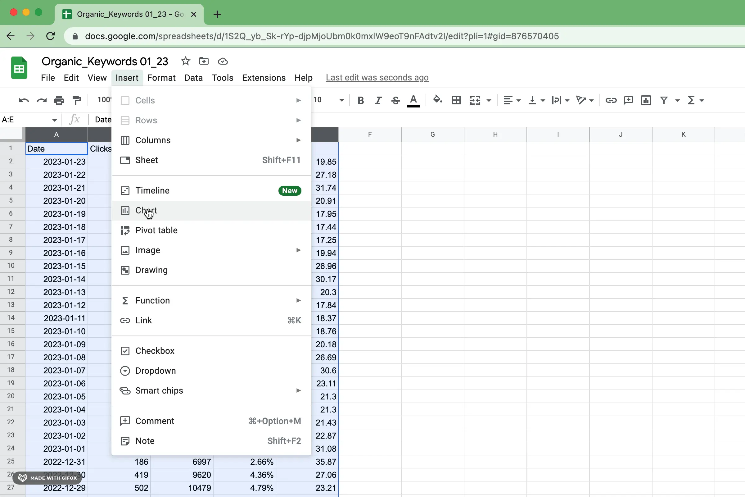
To create your Google Sheets chart with ease, open up Google Sheets and choose the data you wish to visualize. Then follow this straightforward procedure:

To insert a chart from the menu, simply follow the steps below.
Google Sheets can usually figure out what kind of data you have and then generate an appropriate chart for your project. While this may not always be exactly as you pictured it in your mind, no worries - you are able to make adjustments until you achieve the desired result. In any case, Google Sheets offers a great way of creating charts quickly and easily.
Google Sheets has a plethora of chart types to effectively present your data in the best light. For further guidance on how to use each type, be sure to check out the Google Support page for helpful descriptions and tips that will make your visualizations stand out from the standard.

If you're looking for more information on configuring basic chart types, you can find those in sections on bar charts, stacked bar charts, column charts, stacked column charts, line charts, pie charts, scatterplots and area charts from our guide.
Each chart type comes with its own unique settings that need to be adjusted accordingly. However, most of the types have common characteristics in terms of configuration which include:
Titles, subtitles, x-axis titles and y-axis labels are all crucial in helping the audience quickly comprehend your data accurately. They provide essential context to what would be otherwise overlooked or misunderstood if skipped. Titles give clarity to the narrative being conveyed by your chart; without them it can easily be misinterpreted.

Refrain from using titles that are ambiguous or can lead to misunderstandings, as they should provide an understandable context for your data. Without this background knowledge, people may be unable to comprehend the meaning behind your chart and therefore leave without grasping what you were attempting to portray.
Axes and series values are undoubtedly the most fundamental part of a data visualization. They allow users to plot their information points along two axes, making it easier to recognize patterns that could otherwise be overlooked from simple tables or written descriptions. By plotting on both x-axis and y-axis, you can easily envision relationships between different variables - helping make sense of what would be an incomprehensible mess!

Every type of chart requires slightly different parameters. When choosing your data and inserting a graph, Google will do the legwork for you by automatically categorizing these values to provide clarity on how precisely you can customize it to suit your needs.
Captivating data labels are integral in many data visualizations, as they provide context to each individual data point and allow onlookers to better comprehend the trends. With effective labeling, viewers can tell a story with their visualizations that would otherwise be nonexistent - highlighting inherent relationships between variables and allowing people to draw meaningful conclusions from the visuals provided.

If your data visualization feels cluttered or difficult to digest, it may be best to forgo the use of data labels. Visuals shouldn't appear overwhelming so if your chart contains too much information it's better not to include any label at all.
Legends play a vital role when it comes to multi-series data visualization. They offer essential context for each element of the chart, enabling viewers to effortlessly comprehend what every symbol or color implies at first glance. Legends are also an invaluable resource that viewers can conveniently refer back to as they take in the information presented.

When constructing a line chart or area chart, the scale of your graph is essential. The chosen range should accurately reflect your data and let viewers to observe each datum precisely. If the scale isn't correct, it may warp how people perceive patterns in the plot. Devote time to make sure that you have selected an appropriate measure for your information!
By harnessing the power of color in data visualization, you can turn a formidable amount of complex information into something more communicable and remarkable. When used appropriately, it not only adds emphasis to essential facts and trends within the data but also makes them easier to comprehend. As an added bonus, vivid colors are eye-catching - making your visuals alluring even before they're studied!
Depending on the situation, it might also be crucial to maintain a unified color palette between your data visualization and brand/website. Having similar colors across different visualizations helps to create an overall look that connects all visuals within a website or organization's brand identity. Furthermore, you can take advantage of color to showcase the same category in various presentations.
After you have perfected the design of your chart, it's time to let everyone else experience its greatness.
Google Sheets makes it easy to share data in the form of charts. By sharing your Sheet, you ensure that everyone is looking at and manipulating precisely the same version - a secure way to collaborate with others!
It's also easy to export your Google Sheets chart as an image! Simply select it, then tap the "Download" button in the upper right corner of your screen. In no time at all, you'll have a high-quality digital file for any purpose you need.
Google Sheets is a very powerful tool. Getting the hang of charting in Google Sheets takes some practice. If you're new to the functionality, be sure to check out our beginners' guide to charting in Google Sheets. If you want to include beautiful Airtable visualizations or charts on Google Sheets that are designed consistently, be sure to try Superchart for free.